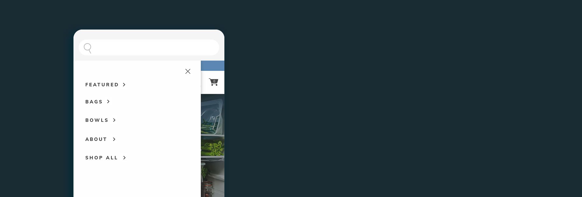
Navigation Redesign
01 Brief
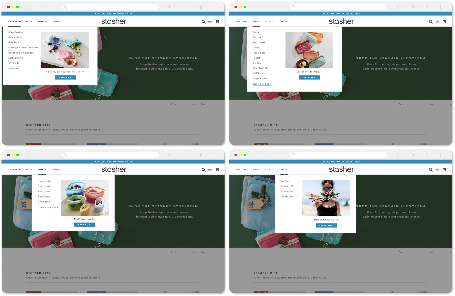
Redesign the DTC top navigation to allow for the launch of Stasher Bowls, the first completely new product since Stasher launched with bags in 2016. First we needed to create room for a new product at all, and help the customer understand how this product related to our original product line of bags. Secondary wishes included the ability to feature products, better organize information, and clearly guide users while being mindful to not create decision paralysis.
I was the lead designer tasked with tackling this project and guiding the team through the design process from ideation through launch.
Role
UX design
information architecture
art direction
Brand
Stasher
02 Challenge
The challenge was to keep the navigation intuitive and simple (fewer clicks to purchase) while adding room for new and featured products. It was important to be sure the changes implemented wouldn’t negatively effect conversion rates since we were going live just prior to a new product launch.
03 Discovery
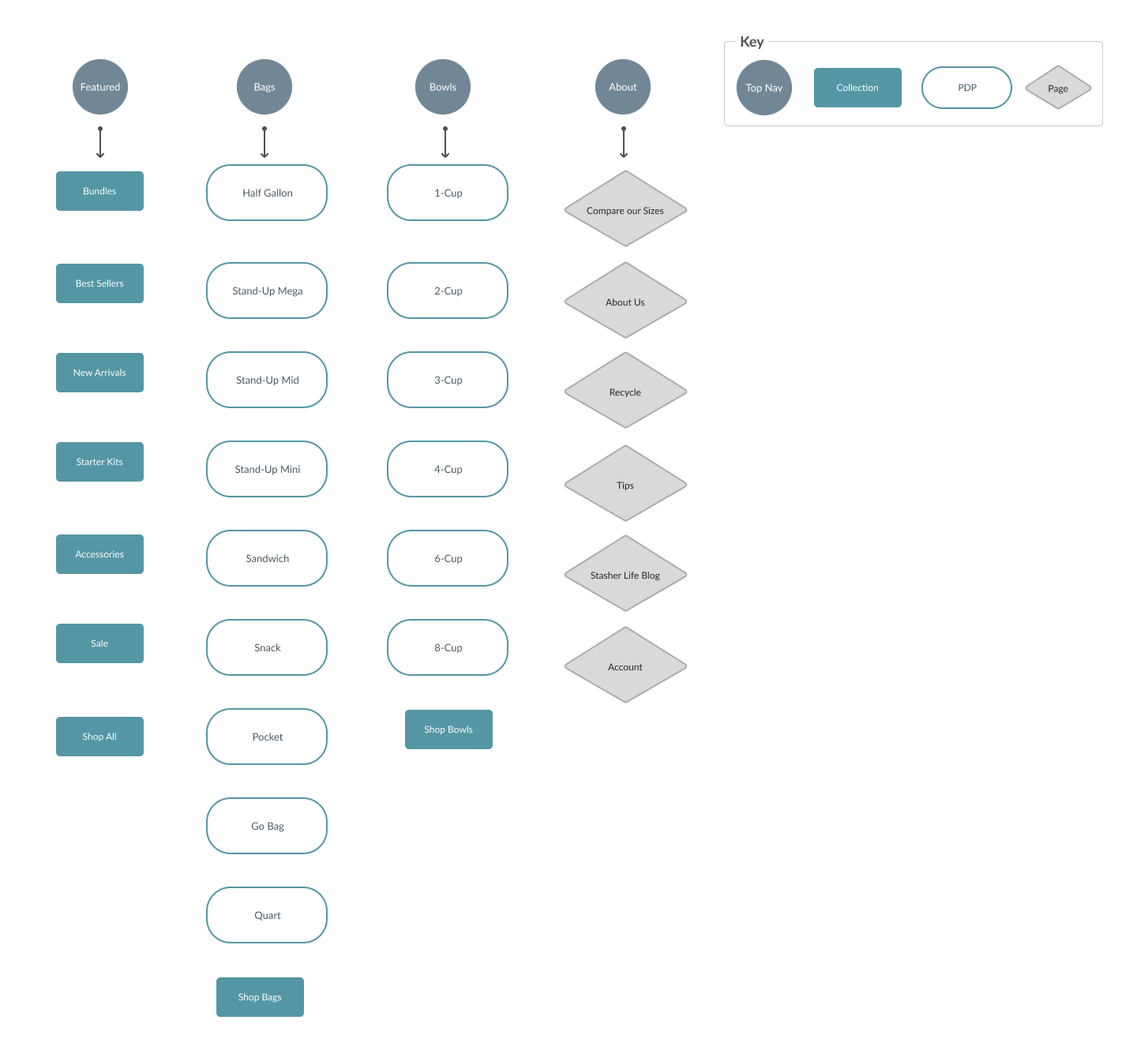
We looked closely at hotspot data from the current site nav as well as top performing messaging via email, and paid ads. This helped us understand what categories our customers were looking for when they shopped our products, and helped inform IA.
In addition to understanding current customer behavior we looked for best practices and inspiration from other e-commerce sites with complex product offerings.
We stayed keenly focused on a mobile-first approach throughout the discovery and ideation process as our research indicated that 70% of traffic came from mobile devices.
Highest Click-through Nav Link
Shop All
Bundles
Sale
Highest Converting PDP
Starter Kit
Sandwich
“Great for on the go and toiletries, I always bring a stasher in my suitcase”
Time Spent
Homepage mini nav
Bundles
04 Solution
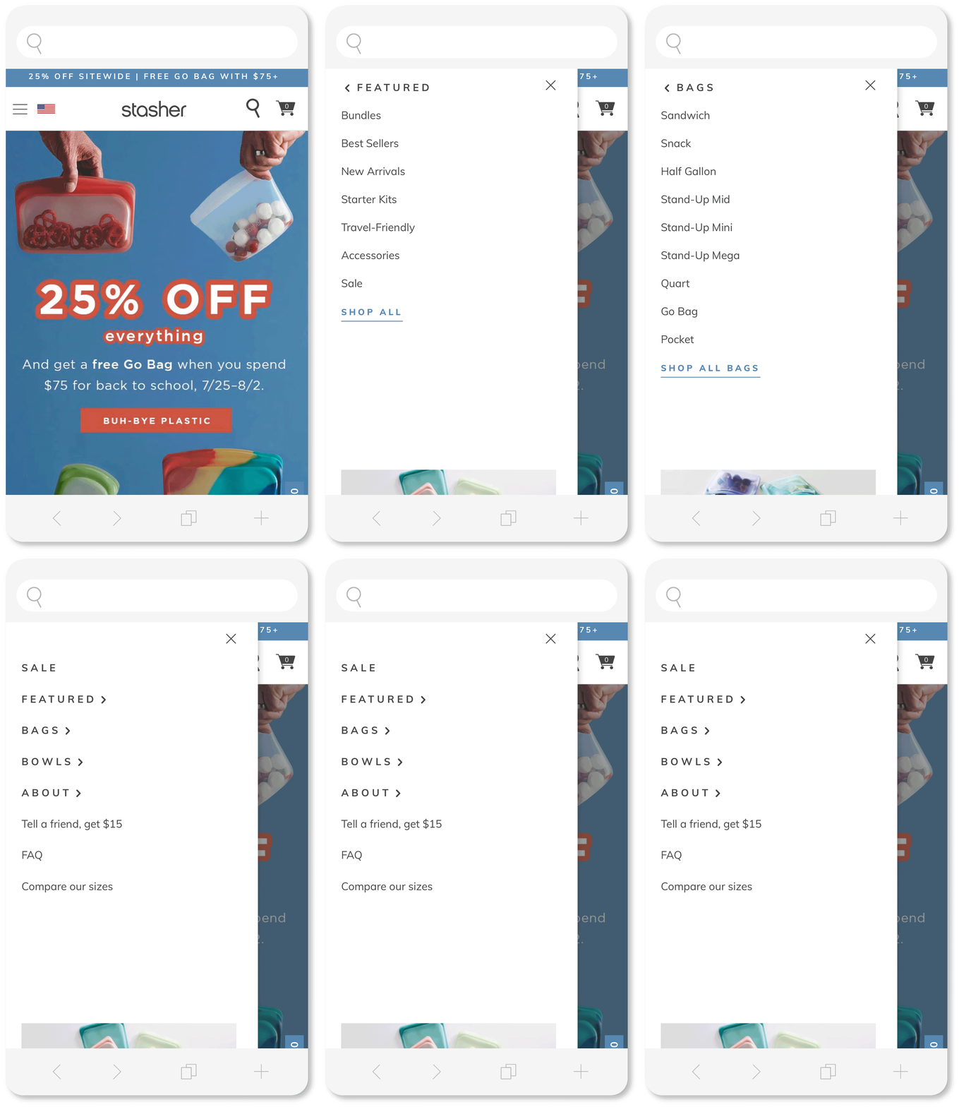
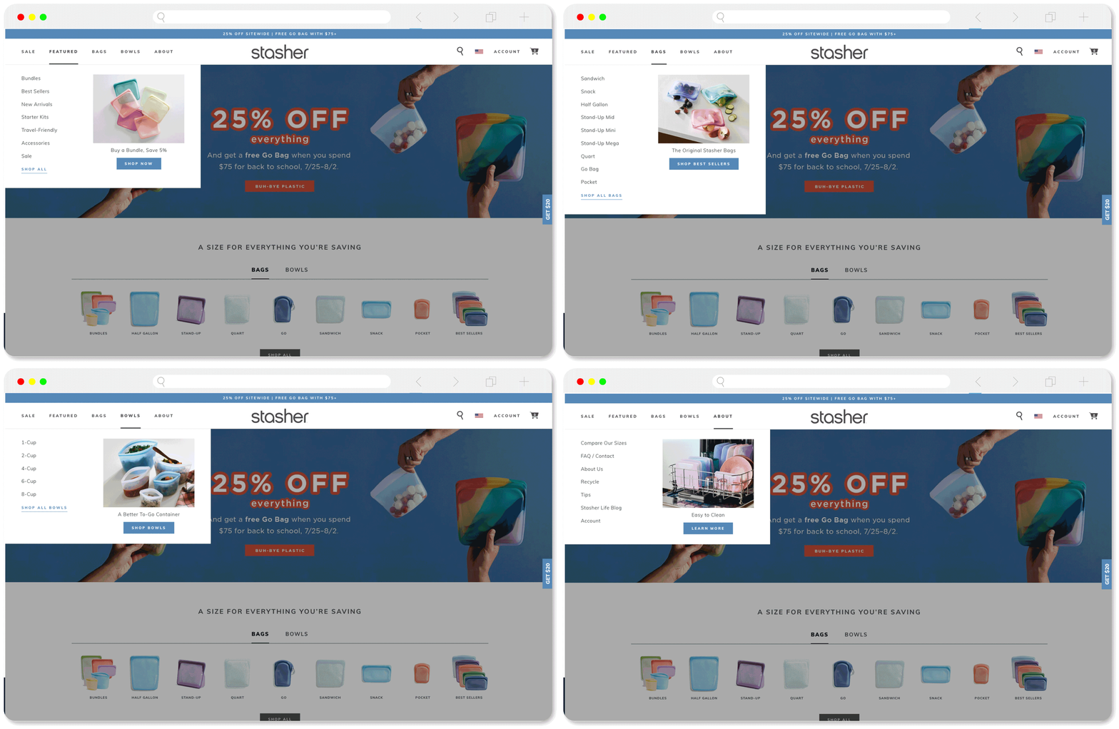
A simple multi-level mobile nav that translates to a straight forward desktop nav with 4 drop downs and the option to add more.
Mobile was the priority so we worked on that first creating the initial nav screen with the ‘top nav’ categories and arrows to indicate their choices. On the sub-screen we then added a way back at the top. We used typography to differentiate the levels of the nav as well as the shop all option.
On desktop we moved Account to the right hand side as it was one of the lowest engaged nav links and further created space for growth of categories on the left.
Lastly, we added individual imagery placements with captions and a CTA to each of the drop downs on both desktop & mobile. These act as places to showcase featured products, sales, and events, allowing more top level storytelling throughout the site.
05 Launch
I worked with our dev team right up until launch to test and re-test all aspects of the new nav. We also baked in a revert plan in case things truly went badly and we needed to revert back to the old nav.
However, all our planning worked out and we launch was a great success! We were able to showcase the new bowls launch throughout the new nav promo spots.
06 Results & Reflections
Over the following weeks & months we kept a close eye on site metrics and saw an overall increase in conversion rates as well as our nav promo image spots rank in top clicked areas of the site.
We have continued testing the new nav throughout the year, and updating our product collections according to the results. We also regularly change out our nav promo spots and continue to learn from their performance.
I really enjoyed this project because the result ended up being so simple yet effective. Over the course of the last year, I’ve see the benefits of this new system as we launch new colors, accessories and the gift guide and have been able to feature these launches within the top nav.
Other Projects.
-

Cliqz by Triller Launch
-
Building a Project Comparison System
-

Beauty Launch Site Experience


